Chronodget Usage Manual
Introduction
Chronodget is an app enabling users to create their own time based widgets for iPhones and iPads with iOS/iPadOS 15 and newer.
On the Home Screen of an iPhone or iPad there are mostly icons which are used to open apps. Those icons don’t show any other informations except a small image and name identifying the app. Widgets are larger than app icons and show more information directly on the Home Screen — e.g. the current weather or the next appointments.
Apple has more informations about the usage of widgets on iPhones and iPads.
The primary motivation for Chronodget is the personalisation of the Home Screen. You can use Chronodget to give your Home Screen a personal touch. Other apps with the same objective show photos from your photo library for example.
Chronodget provides a construction kit you can use to build widgets which change as time goes by. With this construction kit you place simple geometric shapes like rectangles or circles on a widget and define how the different properties of the elements change at certain points in time.
The most obvious kind of widgets you can build with Chronodget are different kinds of clocks. Those can be simple analog or digital clocks or more complex clocks like binary clocks or just about any kind of clock you can come up with that tells the time in a way you understand.
But Chronodget widgets can also show the progress up to a certain fixed time or to repeating points in time. Those can be widgets that show how much time remains until an important appointment or until your next birthday.
In this usage manual we’ll build a widget from different components and learn about all the details of the app on our way. The widget that we’re going to build won’t look pretty. It’s just meant to demonstrate all that can be done with Chronodget. Hopefully it will inspire you to build your own great widgets.
The manual is meant to be read from start to end. When you want to look up details about some feature later on, you can use the Table of Contents at the end of it to find the section containing the information you seek.
Creation of a New Widget
Chronodget is prefilled with example widgets on first start, which are then immediately ready for use. You can place them directly on your Home Screen and take a look at how they work. In the app you can then inspect the inner workings of the widgets.
We want to start with an empty widget here to look at all the elements that are used to construct a widget.
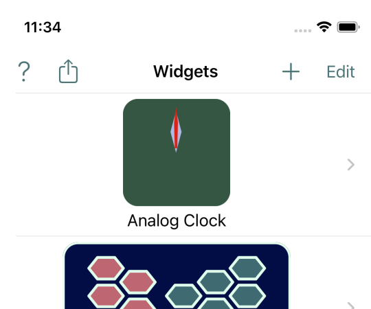
Tap on the +-icon on the top right side of the first screen of the app.
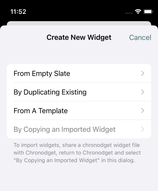
Now you see the different ways to create a new widget.
One of those is to create a duplicate of an existing widget. This is useful if you want to tinker with a widget but still retain its current configuration.
Chronodget also contains some templates you can use as a starting point. Chronodget is prefilled with some but not all available templates.
You can export Chronodget widgets and share them with other people who can then import them.
We choose the first entry and create a widget from an empty template.
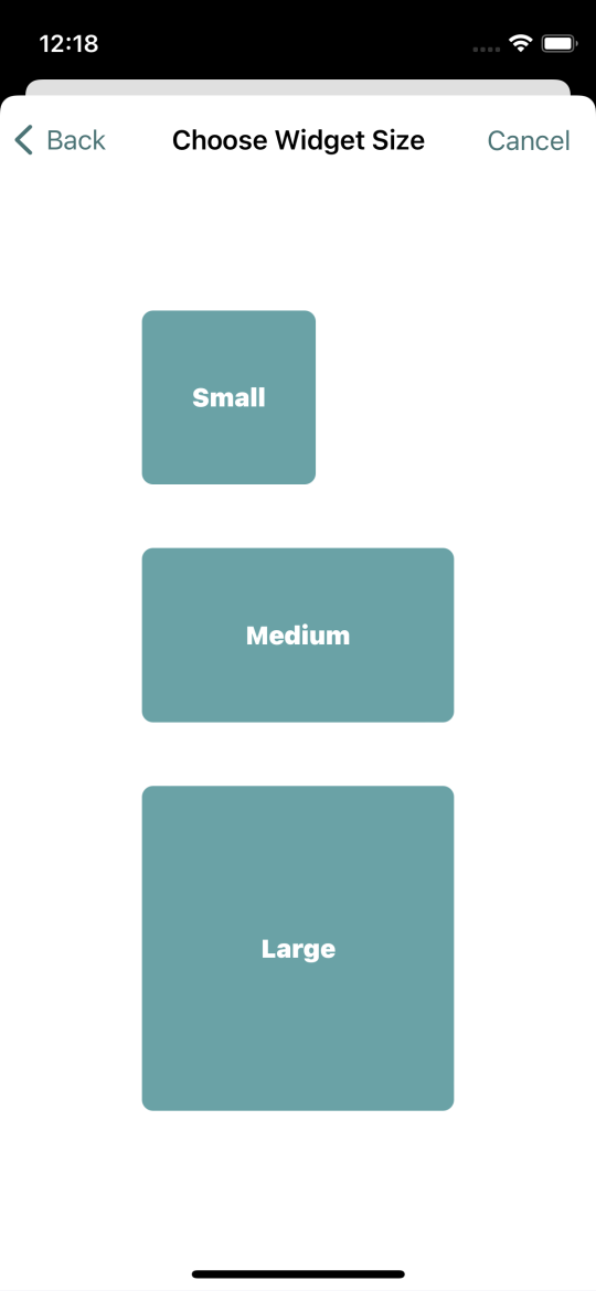
Widgets can be created in different sizes. On the iPhone those are Small, Medium and Large. On the iPad there’s also ExtraLarge.
Choose the Medium size.
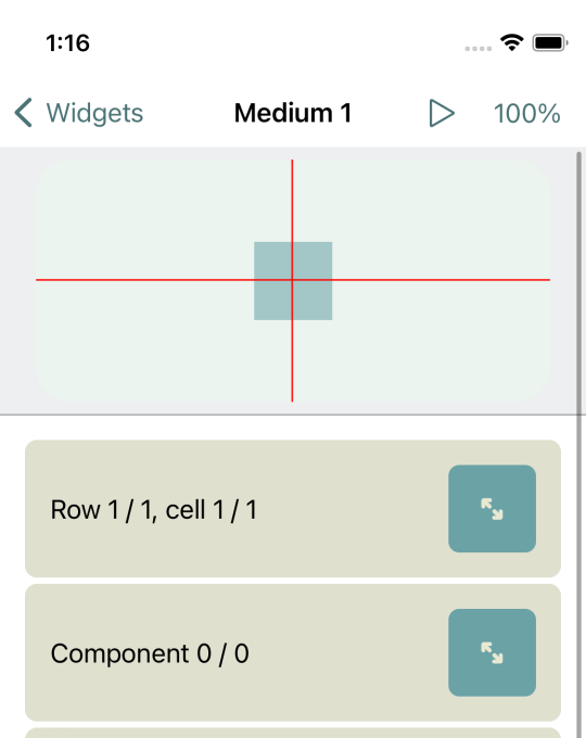
We created our first Chronodget widget which was directly opened for editing.
Below the title bar you can see the preview of the widget and below that the tools you can use to work on the currently empty widget. We’ll look at the tools in more detail shortly.
If you tap on Widgets at the top left of the screen, you’ll go back to the list of widgets. Tapping on an entry in that list will open it in the editor.
Adding a Widget to The Home Screen
Although it’s still empty, our newly created widget is already available for adding to your Home Screen. Take a note of the name of the widget as a first step. You can see the name at the top of the screen. Chronodget automatically chooses default names for new widgets. We created a medium sized widget and Chronodget named it “Medium 1”. The next one would be named “Medium 2” and so on. Those names are boring and we’ll see how to change them later.
Return to your Home Screen and press your finger on some empty area of the screen until a “+”-symbol appears at the top left. Then tap on that “+”. Choose “Chronodget” in the appearing list. Now swipe from right to left on the screen until “Medium Chronodget Widget” appears. Finally tap on “Add Widget”.
Now you see a Chronodget widget on the screen, but most likely it’s not the one you just created. That’s because the first widget of a size is automatically selected.
Tap on an empty area of your Home Screen to make the “+” in the top left and the “-” on the widget disappear. Then press your finget on the widget until a menu appears.
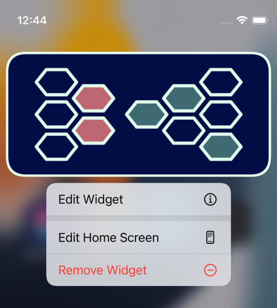
Choose “Edit Widget” here. The only way to edit a Chronodget widget here is to choose another one of the same size.
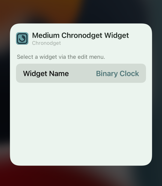
Tap on the name of the widget. In the now appearing list you see all medium sized Chronodget widgets.
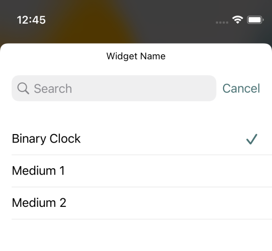
Choose our new widget “Medium 1”. Now you’ll see your widget on the Home Screen. Depending on whether you’re using dark mode or not, it will have a dark or light background. Currently there’s nothing more to see here. We’ll change that shortly.
Change Settings
Let’s return to the Chronodget app and there to editing our widget.
Swipe from the bottom to the top of the screen until you see the entry Settings. Most likely part of the widget preview is now invisible. We’ll change that now to make sure it’s always completely visible.
The section Settings is like all other sections initially collapsed.

On the right side besides the label there’s a button. Tapping on this button will expand the section. Tapping on it again will collapse the section again.
The settings that you see here, affect all widget editors not just the one currently open.
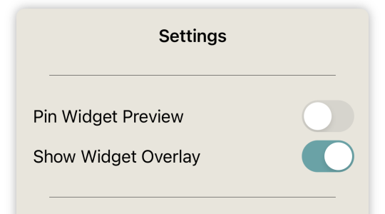
We’ll look at all those settings in this usage manual. But now we are only interested in the first one “Pin Widget Preview”. This setting is initially switched off. That’s because on some iPhones with small screens — e.g. iPhone SE — and if you work on large widgets, the remaining space for the tools is too small if the widget preview is always visible.
Turn this setting on if you have an iPhone with a larger screen — it’s already pretty fine with an iPhone mini. When you now swipe through the list of tools the preview will always remain visible at the top of the screen. You can then always see how your actions affect the widget.
Structure of Widgets
In the preview you see a red crosshair and below that a colored square. The components of a widget reside in cells. Cells again are organized in rows. The rows of a widget are stacked vertically. Rows themselves have no size. They grow and shrink automatically to accommodate their contained cells. Cells are ordered horizontally from left to right in their containing rows. Each cell has its own size. Chronodget centers the contents of a widget. The first cell in the first row is therefore not necessarily in the top left area of a widget.
Our widget has exactly one row with one cell. The cell is at the center of the widget.
The first section in the list of tools is about the rows and cells of the widget. In the collapsed state it currently shows “Row 1/1, cell 1/1”. If you don’t see this section, then swipe down in the tool list until it appears.

Expand this section by tapping on the button on the right side of it.
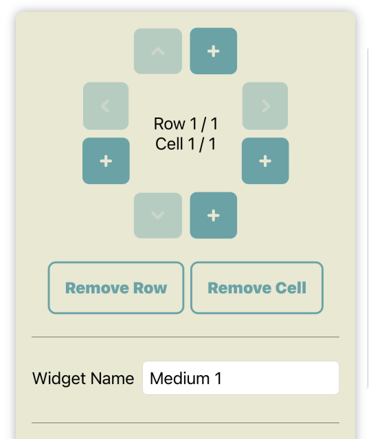
Here you see a control pad. On each of of the four sides there are two buttons. One of those buttons is with a plus-icon and the other one with an arrow-icon. With the plus-buttons on the top and bottom you add rows above or below the currently selected row. With the plus-buttons on the left and right side you add cells before and after the current cell.
Add some rows and cells to test those buttons. Now you can use the arrow buttons to navigate through the rows and cells. Notice how the current row and cell are highlighted in the preview. You can also select a cell by tapping on it in the preview.
Below the control pad there are two buttons you can use to remove the selected row or cell. If you remove a row, the contained cells are also removed. Remove all rows and cells you just added to get us back to the initial state with just one cell in one row.
Many widgets can be created with just one cell. But if there are many components in your widget, separating them into different cells helps to keep an overview of them. In some situations multiple cells and rows are necessary to achieve specific effects. We’ll get there soon.
Naming Of Widgets
Directly below the buttons for the removal of rows and cells you can change the name of the widget. Chronodget itself does not need distinct names for widgets. You can create 10 widgets all named “Clock” and that won’t bother the app. But for you it will complicate matters when you try to pick the right entry from a list of widget names while adding a widget to your Home Screen. Therefore it is a good idea to choose widget names by which you can identify them. But for now you can keep the preset name “Medium 1”.
Size and Alignment of Cells
And now we get to the last part of this large section in the tool list.
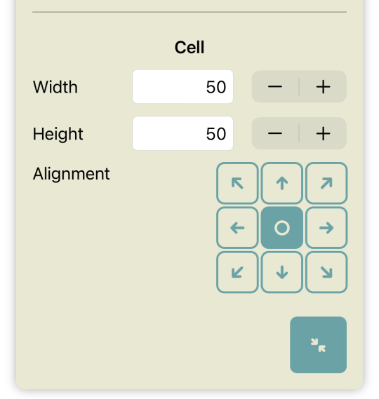
Here you can change the size of a cell and the alignment of components in that cell. Components are not restricted to the size of their containing cells. They can be larger than their containing cells and can even be placed outside of them. The cell is a reference area for some properties of components, though. That sounds a bit confusing for sure. It will all be clearer once we get to that topic.
Components
We haven’t changed anything visible on our widget yet. We have added rows and cells and have removed them again. In the app those changes are visible to us as we see the cells there. But on the widget on the Home Screen they are not discernible.
The visible parts of a Chronodget widget are called components. Components are the topic of the next section in the tool list. In the collapsed state it currently shows “Component 0/0”. There are no components yet. We’ll change this now. Expand the components section.
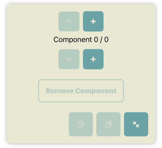
Rows are stacked vertically — from top to bottom. Cells are arranged horizontally in rows – from left to right. With components we get the third dimension. They are stacked from the screen towards you.
As in the section for rows and cell, you’ll find again a kind of control pad in this section, but here there are only buttons at the top and bottom. If there is no component in the current cell, it makes no difference whether you tap the top +-button or the bottom +-button. But it changes as soon as there is at least one component. In that case the bottom +-button inserts a new component directly below the current one and the top +-button directly above it.
Tap one of the two +-button and let’s add our first component.
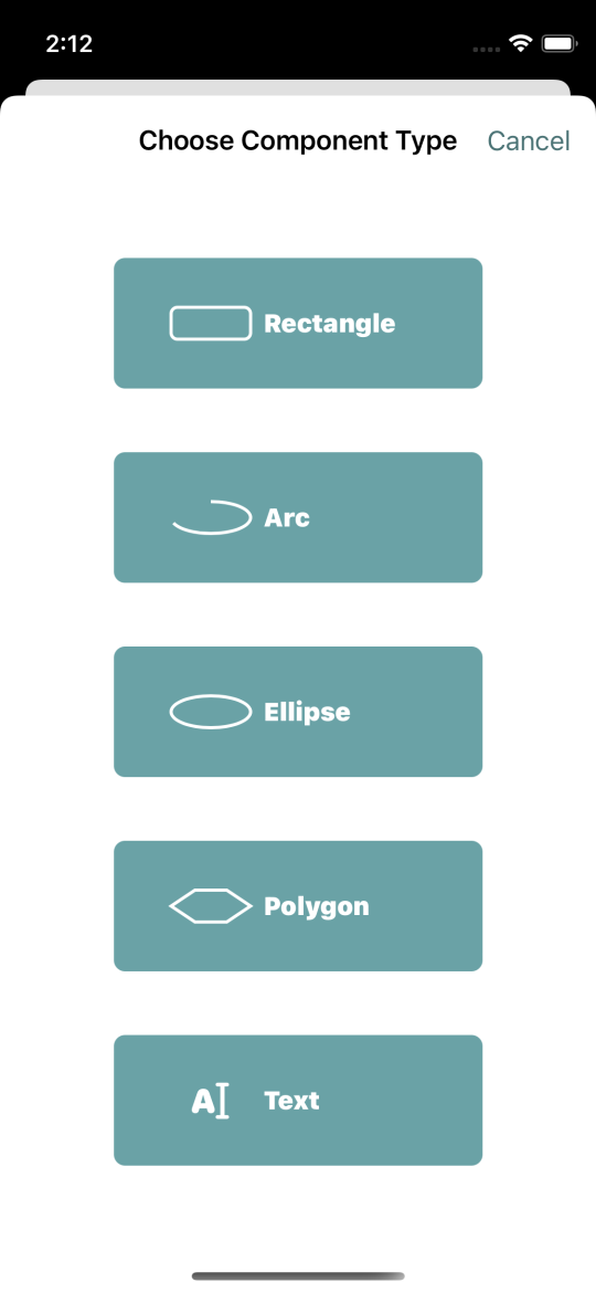
Chronodget widgets consist of simple geometric forms. We have rectangles, arcs, ellipses, polygons and text. Tap the button for “rectangle” to add a rectangle component.
The widget preview doesn’t seem to have changed. There’s still one filled square in the center of the widget. But the fill color has changed. Cells have a default size of 50x50. Rectangles also have a default size of 50x50. Our rectangle component uses the entire space of its cell. We’ll change that in a few moments.
But first let’s have a look at the rest of the components section. As with the section about rows and cells, where we can choose a name for the widget, here we can choose a name for the component. While widgets get a default name, that is not the case with components. Component names are only visible in the app. They may be useful to you as someone creating widgets to be able to faster identify components stacked in a cell. In the control pad you now see “Component 1/1 : (Rectangle)”. That tells you that the current cell contains 1 component and that this one component is the active one. Because no name was chosen for the component, the type of the component is shown in parentheses — in our case “Rectangle”.
Type “minutes” in the the name text field. Now the text in the control pad has changed to “Component 1/1 : minutes”.
We’ll use this rectangle to show the progress of the current hour in minutes.
The last entry in the section is named “Time Frame” and on the right side you see “hourly”. Tapping on that brings up a menu of all available time frame types.
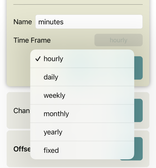
hourly is for things repeating every hour. The minute pointer of a clock makes its run around the clock during an hour and returns to its start point to begin anew for the next hour.
daily is for things repeating daily. You could create an hour pointer that makes its run around the clock in 24 hours. For an hour pointer that would look strange as it normally reaches its start point at noon and makes a second run for the second half of the day. But that poses no problem as we’ll see later.
The pattern repeats itself for “weekly”, “monthly” and “yearly”. And then there is also “fixed” for the case where you want to create something that changes between two fixed points in time.
We want to use our rectangle to show the progress of the hour in minutes. So we stay with “hourly”.
Change
The next 8 sections are colored a bit differently than the previous ones. That’s because they’re all about how the components change as time goes by.
The first of those sections is Change and in the collapsed state it shows “Change 1/1 : 00”. Each point in time, at which we want one or more components to change in some way, is a “Change”. Currently there is just one at minute 0.
After expanding this section you again see a kind of the already known control pad.
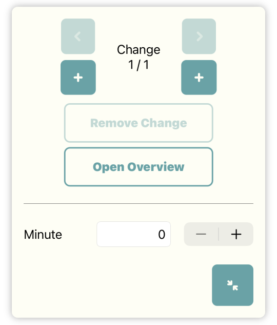
Here we have the + and arrow buttons you already know on the left and right side. On the left side you move towards the start of the list of changes. On the right side you move towards the end. As in the other instances of the control pad, you can remove changes you added. We’ll ignore the new button “Open Overview” for now. We’ll return to it later when it becomes more useful than it would be right now.
Below that button, you can set the point in time for the current change. On an hourly time frame you can only choose the minute in an hour. This part of the UI changes depending on the type of time frame chosen.
Size
The first thing we’re going to build is a progress bar that changes from being empty to filled with the progress of the current hour. We’ll use our rectangle for this.
Our rectangle shall have a width of 0 at minute 0. To achieve that, we’ll ignore the next section named Offset and go to Size which we’ll expand.
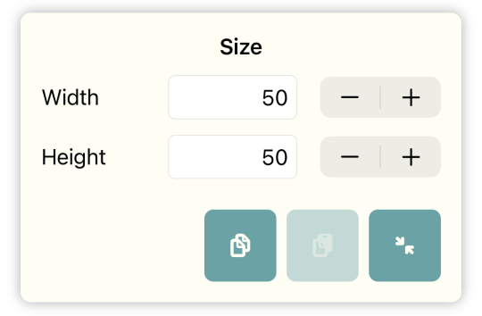
Our rectangle currently has the default size of 50x50. We now change the width from 50 to 0. You can do this gradually by using the - and + buttons or you can tap inside the text field and type in the new width with the keyboard. Use the buttons here. You see how the number in the text field gets smaller. In the widget preview you can also see how the width of the rectangle changes and how the rectangle disappears when the width reaches 0.
Return to the Change section and tap the right + button. In the control pad you should now see “Change 2/2”. Change the minute for that change from 0 to 59.
Back in the section for Size change the width from 0 to 150. When you now look at the widget on your Home Screen, you’ll see — depending on the progress of the current hour — a more or less wide rectangle. At the start of the next hour it disappears and then starts to grow again.
On an iPad we have more screen space available. There you’ll find this section in the list on the right side. Offset, Size and the other properties can be different with ever change. On an iPad you can go from one change to another on the left side and then manipulate the properties at that change on the right side.
Testing Widgets
You can now spend a whole hour in awe looking at your widget on the Home Screen and see how the rectangle changes with time. But when you make some small adjustment or have multiple components, it’s tedious to control the correct functioning of your widget in real time.
Therefore Chronodget enables you to see how your widget will look at any point in time. At the top of the screen in the app to the right of the name of the widget, you’ll find a button that looks like the play button in your music app — somewhat like this ▷. Tap on this button
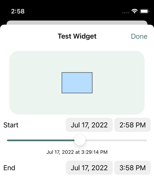
Now you see how the widget looks at the current point in time. Below the widget you can choose a start time and an end time. Initially the start time is the time at which you open the widget tester. And the end time is one hour later in the future. With the slider you can set the currently shown time to a point in time between the start and end time. Depending on how slowly or quickly you move the slider, you see a slower or faster animation of the widget.
You can choose any time period you want here. If you have a widget that changes over a whole year showing the seasons of the year or something like that, then you can look at the whole year here.
Alignment of Components
When you now look at how the widget changes over the period of an hour, you’ll notice that the progress bar gets wider as the hour progresses. But strangely it grows from the center at the same time to the left and to the right. Normally progress bars only grow to the right side.
Close the widget tester and return to the first section of the tools list where you can add and remove rows and cells. As mentioned earlier there’s a subsection in which the size of a cell and the alignment of components in that cell can be chosen. The current alignment is set to “center”.

Tap on the button with the left facing arrow. Looking at the widget in the tester now, you’ll notice that the progress bar now grows to the right. But now the progress bar isn’t centered anymore and appears at the right side of the widget. Changing the width of the cell from 50 to 150 fixes that.
Component Stack
We now have a progress bar that grows during the progress of an hour. But it’s a bit hard to guess how much the progress bar is filled. We’ll put a frame around the progress bar to give us a better indication on that.
Go to the section dealing with components and tap the top + button to add a component above the progress bar. Choose “rectangle” again as the type of component to add. We now have a square with a side length of 50 and the same stroke and fill colors as the progress bar. That does not look like a frame.
Stroke
A bit further down the list of properties, you’ll find a section titled “Stroke”. There you see that the stroke of the component has a width of 1 and the color of that stroke. Expand this section.
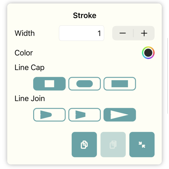
Change the width to 4. In the widget preview you can directly see the effect of that change. Below the already known number based input for the width of the stroke, you can choose the color for the stroke. Tap on the circle to the right of “Color”.
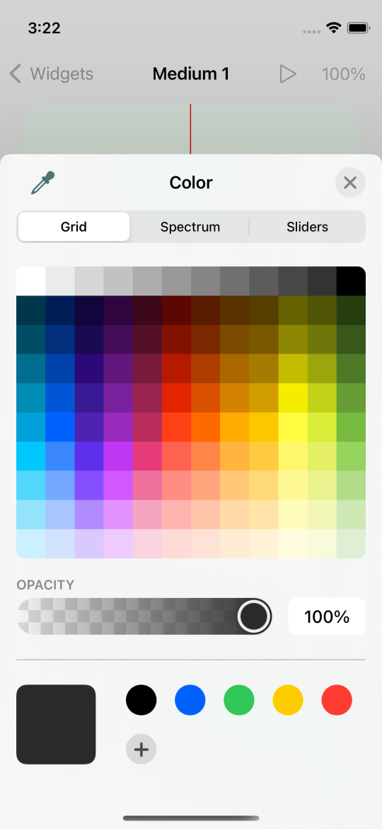
This opens the color chooser, in which you can use one of three ways to select a color. Play around with this a bit. After deciding on a color tap on the x a the top right of the color chooser to close it.
The next two settings in Stroke affect, how corners in the stroke look. On a square in the current size, you probably won’t see any changes.
Preview Magnification
Sometimes you want to have a very detailed look at how something looks in the widget. That is useful when you want to position components exactly or like here to see how changes in line cap and line join affect the stroke of a component.
You can use a magnifying glass if you have one, but Chronodget has a built in magnifying glass. To the right of the tester button at the top of the screen you’ll find a button labeled “100%”. That 100% tell us that the preview shows the widget in the size it would have on the Home Screen. Tapping on it opens a menu at the bottom of the screen.
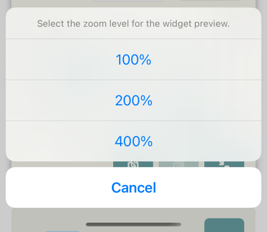
The menu has three entries — “100%”, “200%”, “400%”. You can view the widget in the preview in the original size, in a doubled or in a quadrupled size.
Choose the quadrupled magnification. You can change the visible part of the widget in the preview by tapping on the preview and then by moving your finger on the screen. Look at how changes to line cap and line join affect the stroke now. On a square you won’t see any difference in some cases even at this magnification level, but on triangles and other types of components the changes will be very apparent.
Fill
Depending on how much the current hour has already progressed, the new component covers the whole or a part of our progress bar. We want to use the component as a frame. So we need to remove the fill of the component.
The next section after Stroke is Fill in which we can set how a component is filled. We have four kinds of fills to choose from.
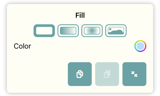
Those are represented by the four buttons directly below the title of the section.
- Solid Color: This is the simplest kind of fill. Like with the stroke you can select one color that will be used as the fill of the component
- Linear Gradient: Here you select a start and an end color and whether the gradient is from left to right or from top to bottom.
- Radial Gradient: This is a gradient from the center of the component. I won’t explain how it exactly works. Just play around with the settings and see how your changes affect the fill of the component.
- Image Fill: Here you can choose an image as a fill. This is the most complex kind of fill. We’ll look into it later when talking about widget backgrounds.
To remove the fill tap on the first button — the button for the solid fill — and open the color chooser.

In the lower part of the chooser you’ll find a slider labeled “Opacity”. It’s set to 100%. This means that the color totally covers anything behind it. When you pull it more to the left side, the color gradually becomes transparent. Move it to the 0% position. The color is now totally transparent. The effect is the same as if there were no fill at all.
Offset
Our frame is now a square with a stroke and a transparent fill. We can again see our progress bar, but the frame doesn’t frame it yet. We want to have a small gap between the frame and the progress bar inside it. That way it will be really visible that the progress bar is inside the frame.
We have set the alignment of the components in the cell to be left aligned and vertically centered. But we can move components relatively to that alignment. And components are not restricted to the bounds of the cell. The cell is only a kind of anchor for its components.
Open the section Offset a bit further up in the properties list. Here you can move the component horizontally and vertically by changing the x and y values. Give it a try and notice how the position of the frame changes in the preview.
Change the y value again to “0”. We want the frame to stay vertically centered. Set the x value to “-4”. With that the frame begins some pixels before the progress bar.
Now we need to adjust the size of the frame. You already know the section Size. It’s just below Offset.
Our progress bar has a width of 150 when completely filled and a height of 50. We want our frame to be 4 pixels larger on each side. For that we set the width to 158 and the height to 58.
Look at our widget in the preview. That looks pretty well now. The progress bar for minutes is now contained in a frame and we can make a good guess as to how much is still left of the current hour.
Shadow
We can improve the look of the frame a bit. We can give it a shadow. With a shadow it will look like the frame is floating a bit above the progress bar.
Open the Shadow section which you’ll find directly below Fill. “Shadow” is a more technical term here. Basically all this is about here is painting something behind the component that looks like a shadow if a darker color is used. When you use yellow or some other bright color then you can produce a glow effect. With the “Radius” setting you decide how much the effect spreads to all sides.
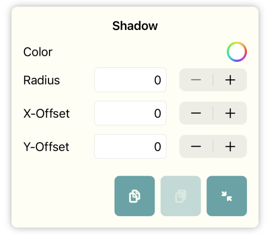
With x-Offset and y-Offset you move the effect horizontally and vertically. If you presume the light source to be on the left side and above the component, then you would need to choose positive values for both offsets — for example 3.
For a glow effect you would leave both offsets at 0 and maybe choose a bigger radius.
Go ahead and experiment with all the settings until you find one you like.
Rounded Corners
There’s one more thing we can tweak here. We can give our rectangles rounded corners. On progress bars it looks more modern if the corners are rounded a bit.
The section Rounded Corners is above the section for Stroke.
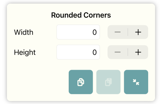
Choosing the same value for “Width” and “Height” here will produce horizontally and vertically aligned rounded corners. With different values you can achieve some interesting effects.
If you choose rounded corners for the frame, then you will have also to do it for the progress bar. Otherwise it will look strange. On the progress bar you’ll have to set it for both changes. Like with any other property the roundedness of corners can change with time.
The Hour Pointer
We now have a progress bar for the minutes in the current hour. That looks nice, but how would we build an analog clock having pointers that go around in a circle? We’ll look at this in the next example when we build an hour pointer. We need a new component which we’ll add to a new cell.
Open the first section for rows and cells and add a row above the current one.
The new cell that was automatically added with the new row is just what we need now. But it is too small. Change the size of the cell to a width and height of both 80. You can do that in the lower part of the section where you just added the row. The centered default alignment for the cell is what we need here. So there’s no need to change that.
Polygons
To add a component for the hour pointer tap on one of the two + buttons in the component section and choose “Polygon” as the type of component to add.
An hour pointer moves around over the whole day and starts at the beginning on the next day. So we choose “daily” as the type of time frame for this component.
Sides
The the component we just added currently looks like a triangle. It’s a polygon with three sides. Polygons are defined by their sides which all have the same length when the polygon has the same width and height. With a growing number of sides a polygon tends towards a circle form. For our hour pointer we want to use a polygon with 4 sides.
Between Size and Stroke you’ll find the section Sides which wasn’t there before.
Some properties like Size and Offset are available for all kinds of components, but there are also properties that are only available for specific types of components. Sides is only available for polygons.
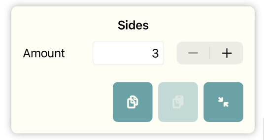
Set the number of sides to “4”. Our polygon is now a square standing on one corner. That doesn’t look like a pointer yet. Change the size of the component to a width of 10 and a height of 40. Now we have to move it to the top of the cell to have it rotate around the center of the cell. Change the y-Offset to “-20”. Now our pointer is in the 12 o’clock position at which it will be twice a day at 12 am and 12 pm.
Choosing The Time
For 12 am the hour pointer is already in the right position, but it does not move yet. We need a second change. Open the Change section and tap the right + button.
We have a daily time frame and can choose a time for the second change.
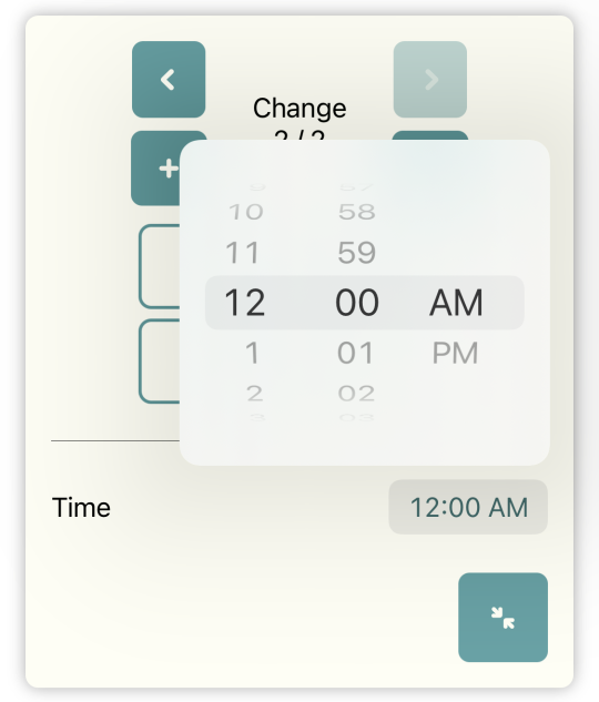
Tap on the time on the right side of the label “Time”. In the popup choose “11:59 PM”.
Rotation
Directly below Shadow you’ll find Rotation. There are two settings here – the angle and a reference point for the rotation.
The angle is specified in degrees. A quarter rotation has 90°. A complete rotation has 360°.
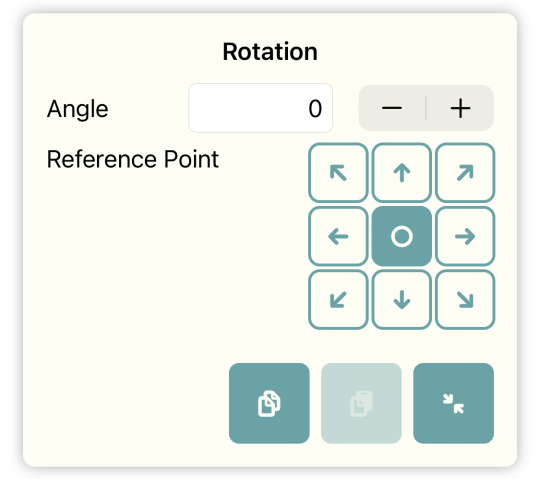
The reference point is the point around which the component rotates. The center of the component is the default reference point. We want the component to rotate around the lower corner and therefore choose the button with the down arrow.
We want the pointer to return to its starting position after 24 hours. If we choose 360 as the angle and look at the widget in the tester, we’ll notice that the pointer needs 24 hours for a complete rotation. On a normal analog clock it makes a complete rotation twice a day. That’s not really a problem. We can choose a value greater than 360 for the angle. The rotation then just goes on after reaching the start position. In our case a value of 720 is the right one.
But if we want to be really precise, then 720 isn’t the correct value here. The pointer shouldn’t be in the 12 o’clock position at 11:59 PM. It should move there at 12:00 AM. 24 hours have 1440 minutes. At 720° for 24 hours we have 0.5° for each minute. At 11:59 PM the pointer should be at 719.5°. But we can only set whole numbers for the angle. It’s not really that big a problem because the half degree isn’t really that much visible. But we can do better nonetheless.
Sequence of Changes
To understand how we can do better here, we need to look at the inner working of Chronodget in respect to changes.
Until now we might have come to the conclusion that the points in time set on changes must be strictly chronological. That is not the case.
Chronodget checks for each component how it should be shown for every minute. For that it takes the current time — 12:33 PM for example — and then looks through the list of changes defined for that component. It starts with the first changes and searches for the first two changes between which the current time fits. We now have two changes — 12:00 AM and 11:59 PM. Each time fits between those two. What would happen if our changes were at 12:00 AM and 12:00 PM, though? 12:33 PM does not fit in there. In this case Chronodget looks at the interval between the last and first change — 12:00 PM and 12:00 AM. 12:33 PM is inside that interval. We could also have a component with three changes at 03:16 PM, 09:20 PM and 02:00 AM. Chronodget would correctly recognize 04:01 PM to be between 03:16 PM and 09:20 PM, 01:30 AM between 09:20 PM and 02:30 AM and 10:10 AM between 02:30 AM and 03:16 PM.
With this insight, we could set the rotation angle to 360° and the time of the second change to 12:00 PM. At 12:00 AM the pointer is in the 12 o’clock position. At 12:00 PM it has finished a complete rotation and is again at the 12 o’clock position. And because Chronodget also uses the interval between 12:00 PM and 12:00 AM, the pointer then again returns to the 12 o’clock position.
When we look at our widget in the tester, we’ll notice that the hour pointer runs backwards after 12:00 PM. That’s not really how it should be. It should always run forward.
When Chronodget finds the interval for the current time, it calculates the precentage progress for the current time in that interval. 06:00 PM for example is at 50% between 12:00 PM and 12:00 AM. With that value it looks at the values of the properties at the two changes. In our case the start value for the rotation angle is 360° and the end value is 0°. We get 180° for our 50%. That’s why it runs backwards in the second half of the day.
Chronodget does this sort of calculation for every property and not only for the rotation or sizes of components. It also calculates intermediate values for colors and numbers of polygon sides.
The fix for our problem that the pointer should always run forward and reach the 12 o’clock position at 12:00 AM and not already at 11:59 PM is to set the time for the second change to 12:00 AM and the angle to 720°.
Here’s another detail that will become apparent through a demonstration. If we set the angle on the second change to 810° we’ll see that the pointer will be near the 3 o’clock position shortly before 12:00 AM and that it will then jump directly to the 12 o’clock position at 12:00 AM. That’s because at 12:00 AM the first change is used again. The value of the second change is only used for the times between 12:00 AM and 12:00 AM on the next day.
Arc
We have already used rectangles and polygons. We won’t look at ellipses here because they work very much like rectangles. Arcs are more interesting and we’ll look at them now.
Create a new cell to the right of the cell with the hour pointer with the same size. Then add a new component to that cell with the type “Arc”.
You should now see a quarter circle in the new cell. With an arc you can draw a part of a circle or ellipse. For that there is a new property that is only available for this component type. It’s called Arc Segment and you’ll find it between Size and Stroke.
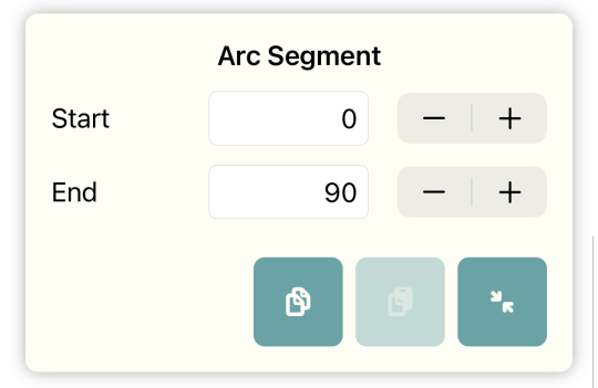
You can define which part of the circle is shown by setting the start and end angles. As with the rotation 0° is at the 12 o’clock position and 90° at the 3 o’clock position and so on. As with the other properties both angles can differ from one change to the next one.
We want to use the arc to build another alternative display of the current hour. Set the time frame again to “daily” and choose a wider stroke. You could set it to “12” for example. If you take the rounded kind for line cap, then you’ll see directly how it affects both ends of the arc.
In the first change we are again at 12:00 AM. Here we want the arc to be invisible. Set the end angle to 0. Now start and end angle are both 0 and the arc is invisible.
Add another change with 12:00 PM and set the end angle for it to 360°. The arc now grows from 12:00 AM until it becomes a full circle at 12:00 PM.
What do we do with the second half of the day? Add a third change with 12:00 AM. If you set the start angle for this change to 360°, then we’ll have an arc that grows clockwise from 12:00 AM until 12:00 PM until it becomes a full circle. And from 12:00 PM until 12:00 AM it shrinks clockwise until it becomes invisible at 12:00 AM. During the whole day you can now see the current hour and by noticing whether the arc grows or shrinks, you see whether it’s AM or PM.
Text
We now want to take a look at the last component type — Text. Add a new cell to the right of the cell with the arc. Set the height of the cell to 80 and the width to 150. Then add a component with type “Text” to that cell.
Text components have two specific properties which we haven’t seen yet. The first one is Text Content and you’ll find it below Size.
Text Content
There are two kinds of text content. For the first one, you can enter a fixed static text. You can use that to label other components. Like with other properties the text content can change from one change to the next. But Chronodget cannot calculate interpolations of it for times between two changes. That’s also the case if you change the fill kind from linear gradient to radial gradient. There is also no interpolation between those two fill types. In those cases the setting for the first change is only used at the exact time of that change and the setting for the second change is used for all other times between the two changes.
If you set the text for 06:00 AM to “Good Morning” and for 12:00 PM to “Good Day”, then you’ll see “Good Morning” at exactly 06:00 AM and “Good Day” at 06:01 AM. To achieve the desired effect, you’d need to have a change at 11:59 AM with “Good Morning”, one at 07:59 PM with “Good Day” and one at 04:59 AM with “Good Night”.
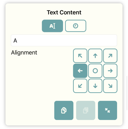
With the second kind of text content you can display the current time in one of several formats. In the simplest case you only need one change for this. Chronodget updates the displayed time itself each minute with the current time in the selected format.
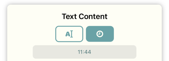
The default format shows the current time. Tap on it to open a list of all available formats.
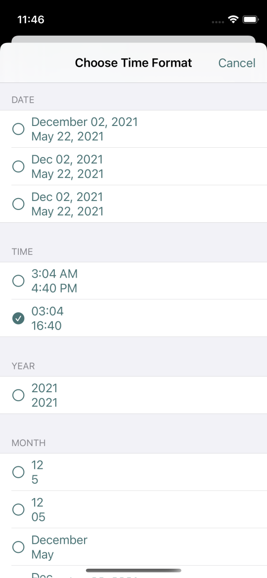
Choose one of the two formats for “Time” here.
Although Chronodget updates the time itself, it can be useful to have more than one change. You could use a different fill or stroke for different parts of the day. In the morning the fill could be a bright color that gets darker as the day progresses.
Font
Depending on what format you’ve chosen, you either see the current value in the component or three points. The text component currently has the default size with a width of 50 and a height of 50. That’s not enough room for a time display with the current font. Change the size of the component to a width of 150 and a height of 80. Now the time should be visible.
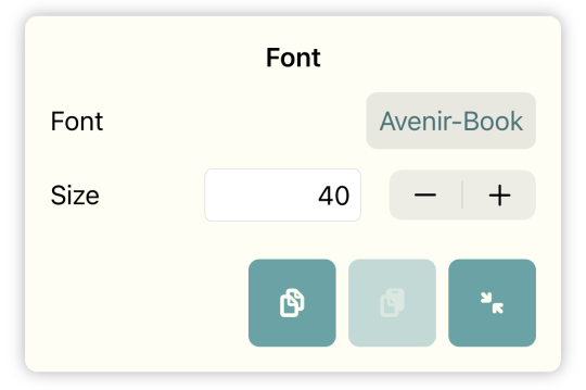
The section following Text Content is Font. Here you can change the font and font size of the text. Let’s take “GillSans-UltraBold” and “30” as the font size.
Text Content Alignment
In the section Text Content there is an additional settting called “Alignment”. That looks exactly like the setting for the alignment in a cell. The alignment in the cell defines how components are aligned in it. The alignment in Text Content defines how the text is aligned inside the text component. The text can be left aligned, centered or right aligned. And you can also set how it is aligned vertically. Text is wrapped and displayed in multiple lines if there is not enough space for it horizontally. Change the width of the text component to smaller values until the time is wrapped and shown in two lines to test this.
Text Component Borders
On all other components it’s easily discernible how wide and high they are. For text components that’s not always the case. The text does not necessarily completely fill the text component.
To make this easier, you can switch on displaying text component borders. Open the section Settings which is the last section in the tools list.

At the bottom of this section you’ll find the two entries “Text Component Borders” and “Text Component Border Color”. The first one switches text component borders on and off. The second defines the color of those borders.
Switch the setting on. Now you should see a dashed line around the text component.
Widget Background and Overlay
After the Rotation section there are two sections called Widget Background and Widget Overlay. The color of those sections differ from the color of the property sections. That’s because they are independent of the current components and the changes of that component.
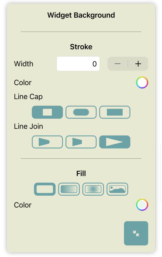
In Widget Background you can set how the widget backgrounds looks. The widget background is behind all components. You can choose a stroke and fill. Both work just like the corresponding properties for components.
The Widget Overlay is shown above all components. Besides stroke and fill you can also select a shadow. By adding a stroke and shadow here you can produce an effect where it looks like the widget is below some cutout hole.
Image Fill
When I described the property Fill, I postponed the description of image fills. That’s because image fills are especially interesting for widget backgrounds.
Widgets cannot be transparent. When you choose a fully transparent color as the fill of your widget background, then your widget will have a white background in light mode and a black background in dark mode. With some work the effect of a transparent widget can be produced.
Leave Chronodget and return to your Home Screen. Tap on a space without icons or widget on the Home Screen — e.g. the space between the last icons on the Home Screen and the icons on the dock. Retain your finger there until you see an x symbol on all app icons. Swipe from right to left until you see an empty Home Screen without any app icons.
Take a screenshot. You can read here how to do that. Tap on the screenshot that you now see in the lower left corner of the screen to edit it.
You cannot use this screenshot in Chronodget yet. Using images that are too big can cause the widget not to be updated or not to be loaded at all. In either case it will look broken.
You now need to decide where you will put the widget on the screen — at the top, in the center or at the bottom.
You can pull on any of the 4 corners of the screenshot to only retain the part of the image you’ll need. If you’ll put the widget at the top, then you can pull one of the lower corners until the top third part of the screenshot remains. Confirm your change of the screenshot by tapping on “Done” at the upper left corner of the screen and choose to save in in your photos.
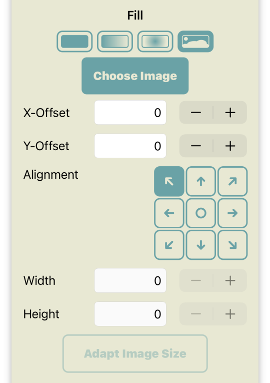
Open Chronodget again and there the Widget Background section. For “Fill” now take the last button which looks like a photo of some mountainous landscape with the sun or moon above it. Tap on “Choose Image” then. Here you can select images that are already used in other widgets, imported images and images from your photo library. Take the last option and pick the just added screenshot.
We’ll ignore the settings for offsets and alignment for now and look at the width and height of the image first. When you choose an image for an image fill, the width and height in pixels is taken from the image. By changing those two values you can stretch or shrink the image horizontally and vertically. On image fills for components those values can differ from change to change. You can produce interesting effects with this.
You will probably have noticed that parts of the image in the widget background and in the preview are much bigger than on the Home Screen where you took the screenshot. That’s because the screen of your iPhone has two different screen sizes. The size with which Chronodget works is the so called logical size. All size and position settings are in relation to that logical size. But your iPhone also has a physical size. An iPhone 13 for example has a logical width of 390 and a logical height of 844. It has a physical width of 1170 and a physical height of 2532. A logical point is 3 physical points wide and high.
When you load an image for an image fill, one point in the image is mapped to one logical point on your device. Chronodget does not know where the image is from and therefore uses the original size of the image
Tap on the button “Adapt Image Size” and then on “Adapt to screen scale”.
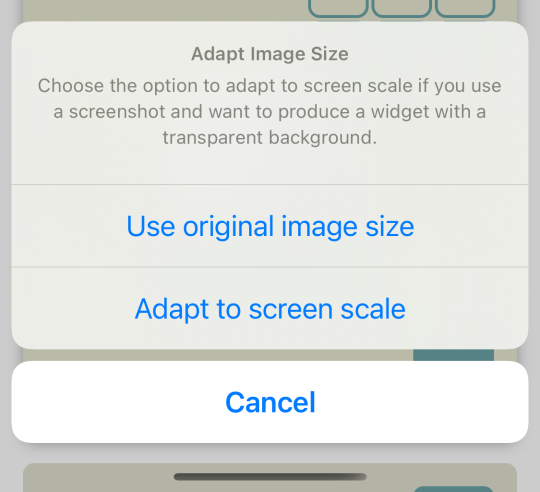
Now the image should have the correct size. But we aren’t finished here yet. When you now look at the widget on the Home Screen, then you’ll notice the + symbol in the upper left corner and the background of the widget isn’t aligned with the background of the Home Screen. That looks broken and not really transparent.
Tap on the button with the arrow pointing to the top as the alignment of the image in the image fill. With that we’ve fixed the horizontal alignment, but vertically it doesn’t look good yet. Tap on the - button for the y-Offset until the + symbol disappears in the widget preview. If you have a simple single color background, then doing that should be enough. If your Home Screen background has a pattern or contains some other elements, then some more work is needed. You’ll have to switch between Chronodget and your Home Screen and adjust the y-Offset until the background in the widget has the correct position to blend with the background of the Home Screen.
Copy and Paste
We have now looked at all types of components and properties available in Chronodget. But there are some additional features that help in the creation of complex widgets. We’ll look at those features now.
In the Components section and in every properties section there are two additional buttons to the left of the expand/collapse button when the section ist expanded.

The left button showing two overlapping documents is used to copy components and properties into the pasteboard.
Tapping on this button in the components section will open a dialog listing all components in the current cell.
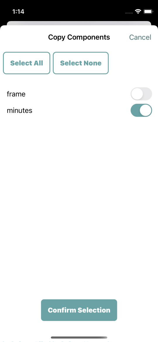
The currently selected component is also preselected in this dialog but you can choose any other component from the current cell to be copied. Components are copied with all their changes and properties. The binary clock that is preinstalled in Chronodget uses 11 hexagons all working very similarly. They have the same stroke and there is one fill color for hour hexagons and one fill color for minute hexagons. It would be tiresome to create each component for such a widget from scratch.
It’s much easier to just copy a component and paste it into another cell. As soon as you have copied at least one component, the button to the right of the copy button becomes active. With it you can paste copied components into the current cell. You can select any other cell and tap the button there.
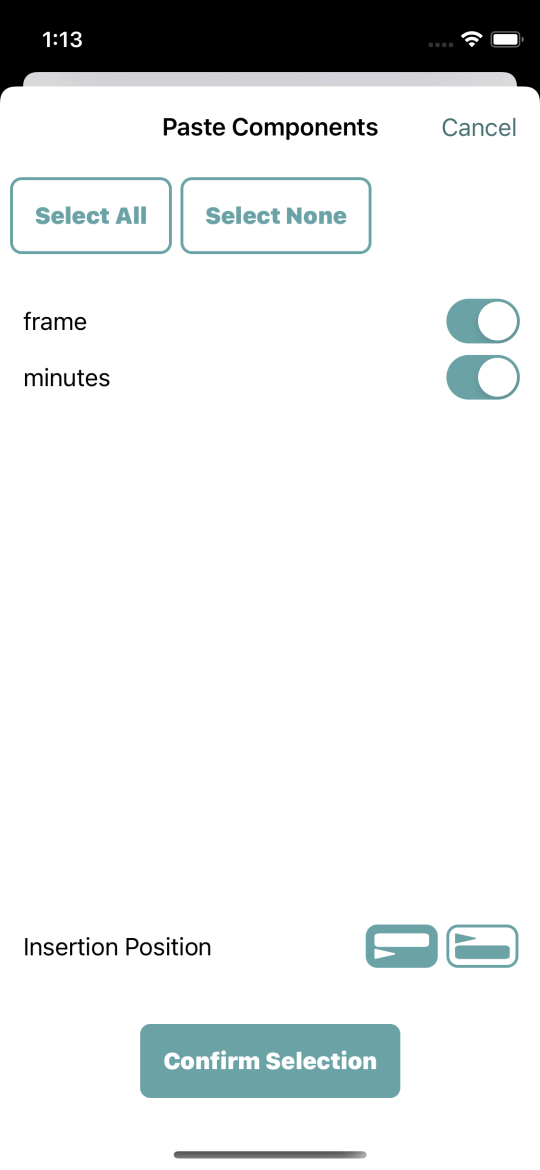
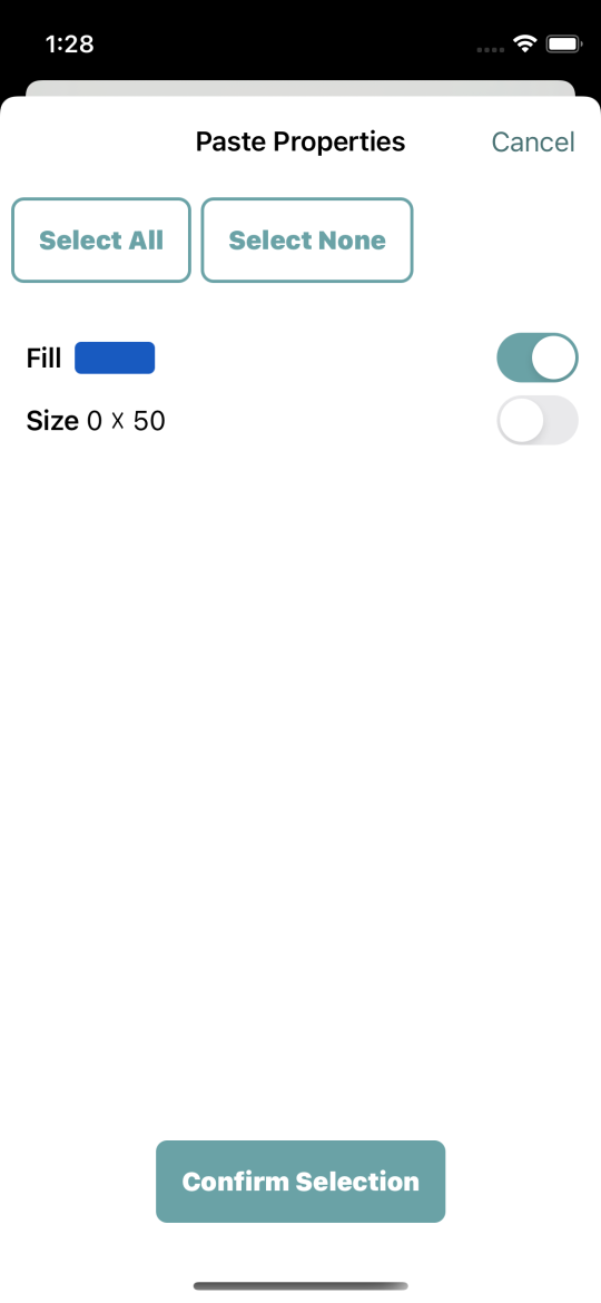
In the now appearing paste dialog you see the components currently on the pasteboard. Here all components are preselected. When you copy multiple components from a cell, then you most likely want to paste them all somewhere else. You could have copied a progress bar and the frame for that progress bar. In that case you want to paste both. And you can choose whether to insert the copied components above or below the currently selected component of the target cell. If there are no components yet in that cell then insertion position is unimportant.
Copy and paste for properties looks very similar to copy and paste for components. If you tap the copy button in a property section, then you’ll see all properties of the component for the current change. The property where you tapped the button is preselected but as with components you can choose any other properties.
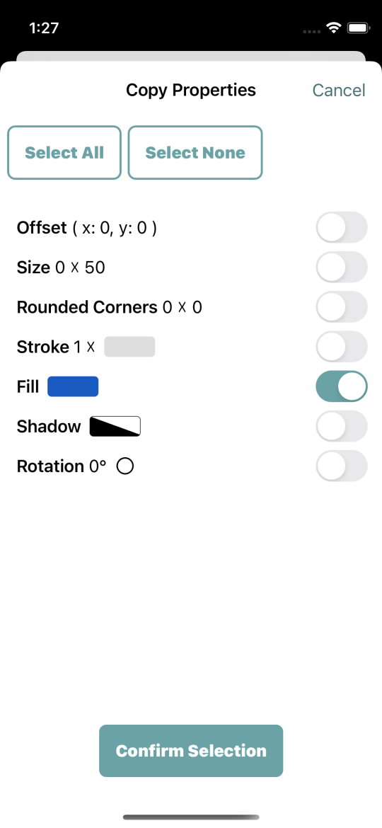
In the paste dialog for properties you see all copied properties . If one of the properties is of the same type as the property where you tapped the paste button, then it is preselected, but you can select any other property. All selected properties will be pasted into the current change.
Changes Overview
Components can — depending on what they do — have many changes. In the mentioned binary clock the hours hexagon “Hours Bit 0” that is located in the left vertical center has 48 changes. The properties of the changes do not differ very much. On even hours like 2, 4, 6, 8 and so on it is empty and on odd hours like 3, 5, 7, 9 and so on it is filled. Now it could happen that you are currently creating such a component with many changes when you decide that you don’t like the fill color. You would select a different color for the current change and would have to paste it into all other changes where the component needs to be filled. That would be pretty time consuming.
That’s where the button “Open Overview” in the Changes section is helpful.
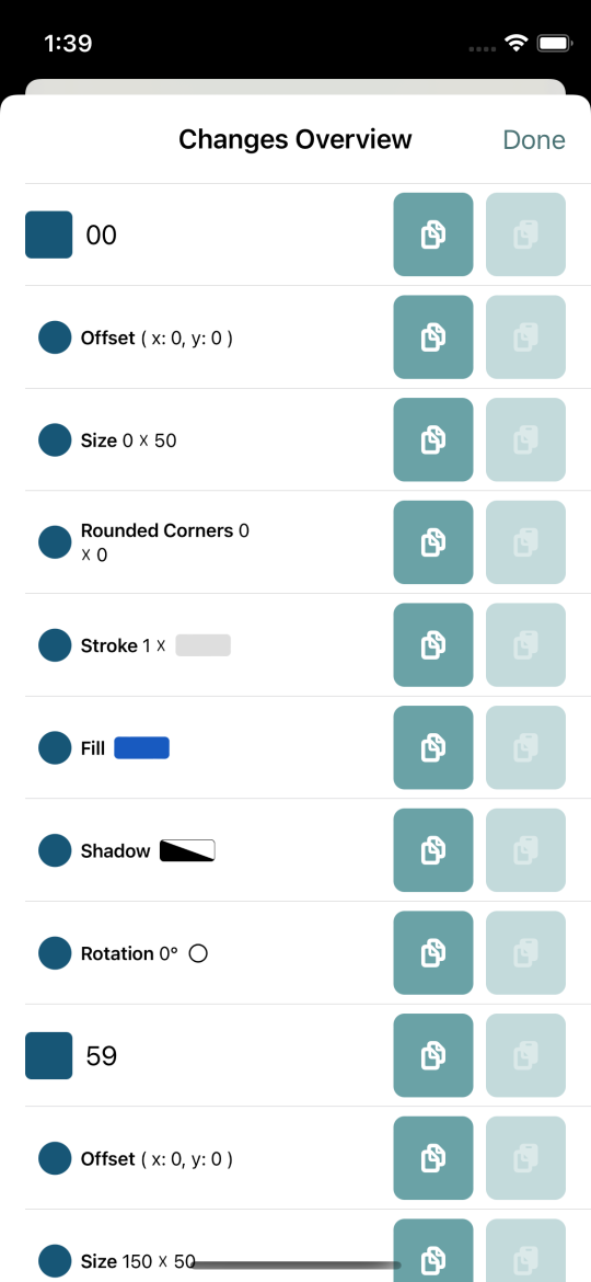
In the dialog that opens here, you see every change of the component with all of its properties. On the right side of every change and every property you see the already known copy and paste buttons.
Tapping the copy button on a change, copies all properties of the change. If you changed multiple properties on a change, you can copy all the properties this way. Then you can paste them on another change. The paste button is deactivated on all changes that already have the same properties as the ones you just copied. You can use this to easily check whether the changes follow an intended pattern. In the case of the binary clock there are always two filled changes followed by two unfilled changes.
Tapping the copy button on a property will only copy that one property. You can then paste that one property independently from any other property. If you want to change the size of the component and have it remain at that size at any time, you can copy it on the change where you changed it and then paste it on all other changes.
Settings
We’ve already looked at some of the contents of this section. Now we’ll take a final complete look at it.
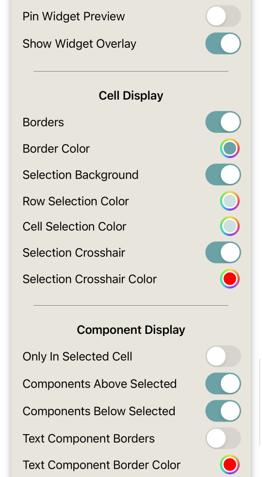
With Pin Widget Preview you set whether the preview is always visible or only if you scroll to the top. If you have an iPhone with a sufficiently large screen, I recommend to have this option switched on. Then you can directly see the effect of any change you make.
With Show Widget Overlay you switch the widget overlay on and off. If you use an only partly transparent image in the widget overlay, it can be helpful to switch it off while working on the widget to see components that will be partly or wholly obscured by the overlay at some times.
In the subsection Cell Display you set up whether cell borders are displayed. You can also setup whether the selected cell and row have a special selection background and what colors those selection backgrounds have. You can also switch on a selection crosshair and its color here. The crosshair can be helpful if your components fill the cells completely and you see no part of the background. The crosshair is always on the top of anything else.
With Component Display you can set up how components are displayed in the preview. You can set up that only components in the current cell are displayed and whether the components above or below the current component are also displayed. The last two options in this subsection are about the borders of text components.
Widget Export and Import
After completing the work on your widget you may wish to share it with your friends. To do that you need to export your widget. You probably already know the share icon from other apps. It’s a square with upwards pointing arrow. A button with this icon is located at the main view of Chronodget on which the list of all your widget is shown.
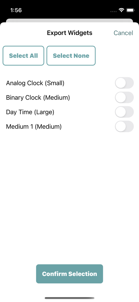
Tapping on that button will open a dialog listing all your widgets. You can select any number of those widget for export. Afterwards tap on the button labeled “Confirm Selection” at the bottom of the dialog.
After a short time the standard iOS share dialog will open allowing you to send the created file widgets.chronodget via e-mail or a social network for which you have an app installed.
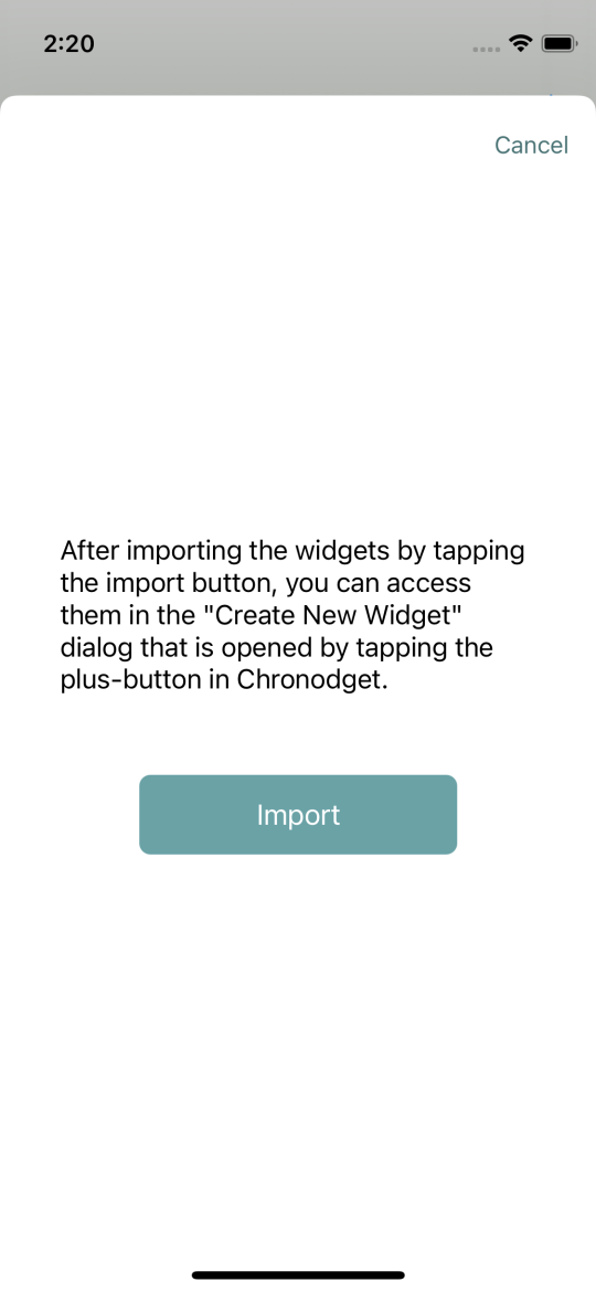
When you get a .chronodget file from someone then tap on it and choose Chronodget in the appearing dialog. Tap on “Import” in the appearing import dialog.
In Chronodget tap on the + button at the top right of the main view.
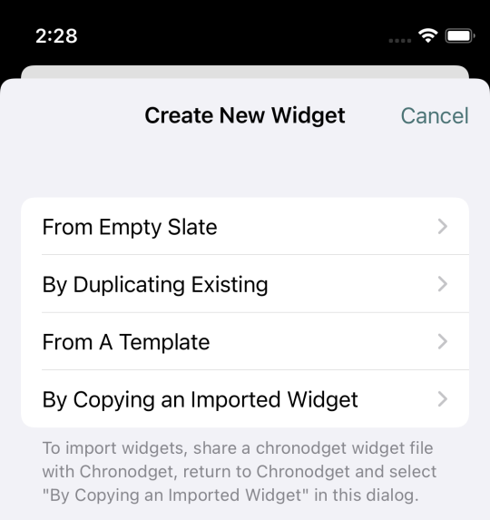
We have seen this dialog when we created our widget. Back then we chose From Empty Slate. Now we take By Copying an Imported Widget. There you see all widget from the last imported chronodget file and can choose a widget to add to your own widgets.
Table of Contents
- Introduction
- Creation of A New Widget
- Adding a Widget to The Home Screen
- Change Settings
- Structure of Widgets
- Naming Of Widgets
- Size and Alignment of Cells
- Components
- Change
- Size
- Testing Widgets
- Alignment of Components
- Component Stack
- Stroke
- Preview Magnification
- Fill
- Offset
- Shadow
- Rounded Corners
- The Hour Pointer
- Polygons
- Sides
- Choosing The Time
- Rotation
- Sequence of Changes
- Arc
- Text
- Text Content
- Font
- Text Content Alignment
- Text Component Borders
- Widget Background and Overlay
- Image Fill
- Copy and Paste
- Changes Overview
- Settings
- Widget Export and Import