Station Eleven

| Tags: book, fiction, sci-fi

“Station Eleven” by Emily St. John Mandel is a novel about the time before and after a swine flu pandemic that kills 99% of the world population.

Even though it’s from 2014 — long before we actually got Covid —, I was amazed about how contemporary it felt. Before the pandemic people use iPhones, the internet and generally do the same things we do now. It seems like not much has changed since the introduction of the internet and smartphones. After the pandemic — which is a lot more devastating than Covid was — all is different. The lights go out and people need to adapt to the new situation.

I won’t dwell on the overarching topic of the novel, though, as it’s not really that important. I’m not really that much interested in novels about pandemics. What made me read this one until the end was the storytelling. The novel keeps switching between the times before and after the pandemic while gradually creating a mesh of relationships between the main protagonists and their actions. It’s interesting to watch it unfold and the pandemic is just a backdrop that adds interesting aspects to the already great story.

The Warlord Chronicles

| Tags: book, fiction, history

“The Warlord Chronicles” by Bernard Cornwell is a retelling of the King Arthur saga consisting of the three books “The Winter King”, “Enemy of God” and “Excalibur”.

Cornwell’s version is — in contrast to other retellings being full of magic — more down to earth. A priestess belatedly realizes that she needs to act as if she’s in a trance to make her prophecies believable. And a girl is painted with some phosphorous stuff to convince people that she is a ghost. There are some convenient coincidences and especially in the last book also some magic like when clay figures are pierced to cause illness and pain in some remote persons. But generally people like Merlin are some early kind of scientists wandering around in the search of knowledge and producing effects that look like magic.

Arthur, who is a war strategist and not a king, lives in a Britain abandoned by the Romans. The old Druidic religion competes with some imported Roman gods and with the spreading Christian religion. The Britons don’t understand the cities, armor and other stuff left behind by the Romans, but they use it and revere it as something from another world. And they fight. The British kingdoms fight each other and the invading Saxons.

Many protagonists known from other retellings of the saga are also present in Cornwell’s version, but they have slightly different personalities. Like Lancelot who is a treacherous scheming coward.

I liked the sober look at magic and mysticism. And while informing me about that particular era in Britain around 500 A.C., the story kept me entertained and invested.

Chronodget 4.0.0 & WeightGlance 5.0.0

| Tags: dev, app, widget, ios, weight, health

This year’s updates of Chronodget and WeightGlance have been released simultaneously. Chronodget is now at version 4.0.0 and WeigthGlance at 5.0.0.

As every year the main reason for those new updates is keeping up with the current development of the OS, the language — swift — and the used SDKs.

This years updates have only marginally visible changes. Most work was done to make them compatible with the new swift 6 language mode. It was actually easier than I initially thought. Maybe that’s because neither app calls any remote web services and therefore has no need for complex concurrency stuff. There’s a bit of it in WeightGlance in the interaction with health kit and Chronodget does some file handling stuff, but generally fixing the swift 6 problems was straight forward.

In WeightGlance I fixed a bug that probably was there since it’s initial release in 2015. Users with no weight data at all in health kit would still see the tutorial data in the weekly rows after closing the tutorial. Not really a critical bug, but annoying nonetheless.

If you’ve already installed Chronodget, you should have gotten the update by now. Otherwise you can always get it in the App Store. The same is also true for WeightGlance which is available here in the App Store
Chronodget 3.0.0

| Tags: dev, app, widget, ios

Chronodget 3.0.0 has landed in the app store. As every year I’ve raised the minimum required iOS to the current one — 17 — and updated the code accordingly.

The usage of the Observable macro that was introduced at WWDC 2023 enabled me to change the code to work as it was originally intended. When I started developing Chronodget in October 2020 I had some expectations regarding how the declarative UI would react to changes in the data model. I was somewhat disappointed that it did not react to changes in nested objects and had to add workarounds and restructure the code to match the capabilities of SwiftUI at that time. With the Observable macro I could get rid of most of those workarounds and make the code much cleaner.

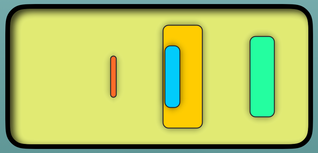
This update comes with two new templates one of which is named “Abstract Timepiece”. It’s not really meant to show an exactly readable time. It just conveys an impression of how time flows. The background changes from morning to evening and also from the start of the year to its end. And the rounded rectangles show the progress of the month, week, day and current hour.

Chronodget Abstract Timepiece

While working on it I noticed that the percentage calculation for monthly time frames was buggy and fixed that.

Also while working on this widget, I noticed not for the first time that when using background objects filling the whole widget, neither the selected cell background nor the crosshairs are visible. Therefore there is now an additional button in the navigation bar to add translucency to every component in the widget making everything behind them also visible.

If you’ve already installed Chronodget, you should have gotten the update by now. Otherwise you can always get it in the App Store.

WeightGlance 4.0.0

| Tags: dev, ios, app, weight, health

Last week I released an update of my weight tracking app WeightGlance.

It’s now at version 4.0.0. The major version jump from 3.0.0 to 4.0.0 is due to the fact that it now requires at least iOS 17 which is somehow a breaking change from version 3.0.0 requiring only iOS 15 and later. As with each such update I modernized the code to be up to date with swift 5.9 and iOS 17.

But there are also two new things in version 4.0.0.

The biggest new change is that with iPadOS 17 the Health app and with that HealthKit comes to the iPad. And WeightGlance now also runs on iPads. It looks like it does on iPhones but on a bigger screen. But it also supports split view and slide over. Getting it on iPads wasn’t just adding that device type and checking all boxes on portrait and landscape modes, though. On the iPhone the app only supports portrait mode, but on an iPad all those possible size changes that occur as you rotate your iPad and use split view or slide over need to be handled, and even though the app uses auto layout, that alone does not suffice here. Also strange was that I had to remove HealthKit from the required device capabilities. Apparently that device capability is now used to constrain HealthKit using apps to only run on iPhones.

The second change adds a bit more information to the overlay that appears when you put and move your finger on the screen. Before it only showed a vertical line and the weight at that length. This is useful to find out what your weight was on a day or during a week in the past. But to find out for which week exactly a bar displayed the average weight was a bit complicated. You had to count the weeks yourself. Now the overlay also displays the start and end date of the week your finger is currently on.

As always you can get WeightGlance on the AppStore.

Epigraver 3.0.0

| Tags: dev, macos, screensaver

The last update to Epigraver in 2021 added support for running on Apple Silicon and there was no need to update it since then.

This year I updated early to the new macOS release macOS 14 Sonoma. At first Epigraver seemed to run just fine on Sonoma as it did on Ventura earlier, but after some time I noticed that the screen went blank showing only the background or that the animations looked odd and broken. Trying to investigate whether it was just broken on one kind of animation, I changed the settings to only use that one animation. But the settings change did not have any effect. It still ran all animation kinds that had been selected before. Now I knew that something was really amiss.

I found this post by a developer of another macOS screensaver who vented about Apple breaking the screensaver framework to be able to run their own screensavers as desktop backgrounds. That post also presents the fix I needed.

With version 3.0.0 Epigraver now also runs on macOS Sonoma. That release increases the minimum requirement to Sonoma, but you won’t miss much if you run 2.0.0 on earlier macOS releases. There is only one additional change which randomizes the animation timing function to add a bit of variation to the animations.

Chronodget 2.0.0

| Tags: dev, app, widget, ios

Chronodget 2.0.0 has landed in the app store. The reason for the major version increase from 1.2.0 to 2.0.0 is that 2.0.0 requires iOS 16. That enabled me to remove some hacks and workarounds and make the code cleaner.

But there are also some visible changes here. The first one is a link to a usage manual on the main screen of the app. You’ll notice a question mark icon in the navigation bar when opening the app after the update. Depending on the localization used by the app this opens your browser on the English or German usage manual for Chronodget. At the start of 2022 I decided to write a step by step documentation after some relatives of mine downloaded the app and told me they had no idea how to actually use it. Having worked on it for a half year and knowing the reasons for all the design decisions that shaped the app, I had hoped that how to use it would be evident, but the feedback spoke for the opposite. I first wrote the German manual and then translated it into English. Both variants have their own localized screenshots and both sets of screenshots are available in a light and dark mode version. So when you open the manual while having dark mode switched on, the website switches to dark mode as it does for any other page and the screenshots shown are from the dark mode variant of the app. I couldn’t resist the opportunity to tweak the code of the website to add dark mode images.

This version of Chronodget also brings two bugfixes. The first one fixes color handling. It has been a known bug since the beginning that sometimes the displayed colors were somewhat different than what was chosen in the color picker. This was most annoying when trying to fake a transparent widget. One way to do it is to make a screenshot and use the right part of it as the background of the widget. A better way for backgrounds that use one color without any gradients or any other effects is to just use the color picker to pick the background color of the screen and use that as the background color of the widget. Doing that isn’t easy but manageable. You open the picker, tap and hold the eyedropper icon, close Chronodget by swiping up from the home indicator and then release the eyedropper while over the background. Back in Chronodget the background color will be selected in the color picker. But now the background of the widget would look slightly different from the background of the screen. It turned out that mixing up color spaces was the problem. The color picker uses display P3 by default and the widgets used sRGB. Now colors are always converted to display P3 and interpreted as display P3 and colors look as expected.

Another bug that existed since the first release of Chronodget was a somewhat broken font handling on some devices. While working on Chronodget I created several widgets with it. One purpose of this was to afterwards have some templates to ship with the app. The other was to test the app and to improve it based on the insights I got from creating more complex widgets with it. At the time as I worked on the binary clock that is included as a template, the app had no copy&paste feature. That widget contains 11 components that look very similar. Recreating it again and again became boring. So that’s how the app got its copy&paste features. Then after adding the text component type I started to implement a clock I had seen somewhere. You have 4 rows of digits for the hour part and 4 rows of digits for the minute part. The digits for the current time light up while the others remain visible and seem to be switched off. It worked out pretty well and I liked that widget. I had to rework it several times because the first version was too complex and would stop working or not even load on the home screen. But in the end I succeeded to create a version that worked fine. It looked good on my iPhone and my iPad. The app was ready to be put in the app store. As I started to make screenshots of the required sizes I noticed that on the simulators for some device types that last widget looked totally broken. I had not idea why. It looked just fine in the app on those simulators but on the home screens it looked horrible. I retained it as a template because it worked on at least some devices, but I had to remove it from the screenshots. With version 2.0.0 I found a fix. The way I used to set the font is affected by dynamic type adjustments. Why that affected the widget on some devices and not on others and why only on the home screen I have no idea. But finally that bug is gone.

Chronodget 2.0.0 does not have lock screen widgets and currently I have no plans to add lock screen widgets. There is literally not much space for customization there. If the standard clock could be replaced with a widget, I would add that to Chronodget.

iOS 17 will be unveiled next month. Let’s see what changes it will bring for widgets. Even without any exciting changes there, I have some ideas for Chronodget. So maybe version 3.0.0 won’t take as long as 2.0.0.

20th Anniversary of beeger.net

| Tags: blogging

Some days ago this blog turned 20 years old. In the first 10 years I changed it frequently. The theme changed, the blogging engine changed and the code changed quite a bit during that time as I gained more experience with HTML and CSS. You can read all about that in the 10th anniversary post.

In the last 10 years the theme hasn’t changed as much and as often as in the first 10 years. The colors only got adjusted a bit and it got dark mode support and the buttons at the top were replaced by simple icons.

Shortly after the post about the 10th anniversary, I changed back again to static publishing. At first with Octopress and finally after updating to Octopress 3 and moving on to using Jekyll directly I ended up with Hugo. With the change to Octopress, Jekyll and Hugo, I have no longer a blogging web application on my server. The website is generated on my computer at home and then uploaded to the server. There is no blogging web application any more needing frequent updates to prevent security issues. As I’m not into live blogging and my blogging frequency is rather low, this setup is perfect for me.

GDPR was a challenge when it was introduced. I already had a somewhat wordy privacy policy and with GDPR it would need to become even longer. This is mainly a private blog. Sometimes I write about the apps I create. That is the only commercial usage. I decided that I wanted to have a simple privacy policy and changed it to

This website does not collect any personal data.

I think it’s fun when you compare it to the long texts you usually see on websites. And it’s true. There is no tracking here. There are no external resources and no social network buttons that notify their networks each time someone visits a page here. I dislike trackers and decided that I really don’t need the insights they generate.

Another bigger change was the restructuring which resulted in the creations section. Before I have been using subdomains or separate domains for my apps and other things I created. Now I can use this section as a kind of portfolio of the things I created.

In some years I write a blog post nearly every month and then there are years like this one when a blog post in June is the first one of the year. I highly recommend using the atom feed or json feed if you don’t want to miss my infrequent posts.

I’m looking forward to the next 10 years. Will it still be HTML and CSS then? We’ll see.

Chronodget

| Tags: dev, app, widget, ios

Chronodget Binary Clock

iOS 14 brought us widgets. I started playing around with widgets just after iOS 14 was released last year, but I soon decided that I really don’t need any of those widgets the apps I used offered. It might be useful to have a calendar widget, a todo widget and a weather widget if you have a tight schedule and much on your todo list, but gladly that is almost never the case for me.

But one day I was in a grumpy mood and thought that a widget showing me a progress bar to the end of that pandemic year 2020 would be useful.

As I wanted to learn SwiftUI, a new way to build UIs for iOS apps, and generally to again do more iOS development than I had the chance to do in my job at that time, I decided to write an app for that.

Clocks aren’t that much different from yearly progress bars. They also change over some period of time. The idea for the app expanded to be a widget builder for widgets that somehow periodically or in a fixed time frame change. Progress bars would get filled and clock hands would move.

With that the name for the app — “Chronodget” — didn’t take long to manifest itself. It derives from “chronos” as the greek word for time and “dget” which is the suffix of “widget”.

At first development was rather slow. I only tinkered with the app on weekends. But after quitting my job in April, I began a sabbatical phase and started really working on the app.

And now it’s here. It’s free and available for iPhones and iPads running iOS/iPadOS 15 and you can get it from the App Store.

As with all things I create, there’s a new creations page with some more screenshots.

The Midnight Library

| Tags: book, fiction

In “The Midnight Library” by Matt Haig a 35 year old woman decides to end her life. In her opinion that life has been a series of bad decisions. And nobody needs her anyways. So there is no reason to keep going on.

But instead of just dying after taking some tablets, she awakes in the Midnight Library where she can try out all those lives she might have had, had she made some other decisions.

It’s a deeply philosophical book ending with a predictable conclusion. But the way to that conclusion is a nice story worth reading.