Today is the 10th anniversary of this blog. With a little help from the wayback machine I’ll take a look at those past 10 years and make fun of my website design efforts.
At first beeger.net was pretty empty. It only contained a logo and I only had it registered to have the e-mail-address robert@beeger.net. Anyway it looked way too empty and as I learned about blogs, I decided to start one myself. I started it by using a Windows tool simply called Blog. With this tool I typed my first posts into an integrated editor and Blog generated the HTML files for me which I then uploaded to the server.
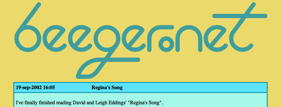
I wanted a cool logo for my website and began sketching some ideas until I had one that looked fairly cool in my mind. Unfortunately my limited talents could not transfer the image in my mind to the screen of my computer or a piece of paper. So I started programming the generation of the logo in Java. The logo is a combination of arcs and lines. I remember running the program over and over again and moving lines and arcs around till it looked good.
Also of note on this one is the background color. Somehow I always liked beige and creamy colors. It also shows in the Squareness look and feel which I created some time later and the current design of the blog.
Back then table layouts were the way to do website design and the table layout is clearly visible in this first version.
After using Blog for a year I switched to MovableType . Back at that time MovableType was a fresh blogging system that I could host myself on my website. It had a nice templating system and posting new blog posts was a joy. But it wasn’t until 2005 that I changed the look of the site.
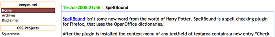
The logo stayed the same, but the background got changed to white and was less aggressive. Though it was still a table layout, it was a bit more subtle by leaving out some borders. Also notice the side menu. Side menus were the big new thing - at least for me - and I spend considerable time to get the CSS right. I also added some CSS-only buttons telling things none really wanted to know like what MovableType version I was using and that the site was valid XHTML 1.0 and CSS.
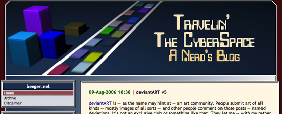
One of my biggest problems of all time is that I always want to create something visually cool but simply fail to make it happen. There’s always so much that gets lost or wrong on the way to the paper or the screen that I dump it. So I’ve always played around with ray tracers and such tools. By combining things in a script like for POV or by arranging them in a tool like blender and then applying materials to those objects one can things that look good without having to be overly talented in drawing.
In January 2006 I was playing again with blender and somehow ended up creating a scene that looks like some highway in cyberspace. I think Tron inspired me here. I spend much time fiddling with it and even added motion blur to it. I liked it so much, I rendered two shots of the scene, came up with the title “Travelin’ The CyberSpace - A Nerd’s Blog” and made it the new theme.
I also played around with CSS and discovered negative margins. You see how the menu and the post box overlap the main content block. It was so nice and looked so cool. Well it did until I tested it in InternetExplorer. InternetExploerer was a real spoilsport. It just ignored those negative margins and it all looked really bad. But I won this fight by adding a transparent margin on the left and right side of the background image. Gotcha, IE!
One of the biggest pains in MovableTime has always been the update procedure. You had to upload the new files to the server, make sure you uploaded some as binary and most as text and then there always were some other steps to take care of during an upgrade. Also it got more and more bloated with each new version. So in November 2010 I decided to move to WordPress. With the move to WordPress I also decided to give the site a new look. I took the minimal HTML5 starter theme and tweaked it until it looked like this:
Actually that’s not entirely true. Back then the main title was just “beeger.net”. Unfortunately moving away from static publishing with MovableType to dynamic publishing with WordPress has the effect that the wayback machine can no longer make snapshots of this site. Anyways the look is still the same.
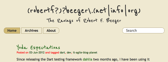
I wanted the website to be readable on a mobile device like an iPhone. So by applying some “mobile first” thinking I got rid of the side menu. There are now only three buttons at the top and a search box. Here’s some more playing around with CSS. Inspired by Mac OS X segment buttons I used children selectors to make the first and last button round at one side. Since it should be readable on mobile devices and mobile devices are often on the way with low bandwiths, I decided to try to make a theme that would use no images. I browsed Google’s WebFont library and came across a font named “Reenie Beanie” while searching for some font that looks like handwriting. The description of the font tells us that “Reenie Beanie could be used to represent the scribbling of a mad scientist, or the recipes of a genius chef.”. As the subtitle of the website was set on “The Ravings of Robert F. Beeger” the font was a perfect match. Even after more than a year I like this combination of Reenie Beanie for titles and Trebuchet for the rest of the text.
The latest change is only 3 months or something like that old. “beeger.net” looked like a boring title and one day as I registered some more domains, I thought it would be fitting a nerd to have some regular expression as a title. So that’s how the current title came to be. All of the domain names you can generate from it forward to this site.
And well, the background is again a beige tone. Not as aggressive as 10 years ago, but still.